The feature of today’s Script Spotlight is an older tool that is not groundbreaking or super sophisticated but it will make your chart reading faster.
It is called The Detrended Price Oscillator and it is very similar to a simple moving average.
Detrended Price Oscillator Strategy by HPotter
//  Copyright by HPotter v1.0 30/03/2017
study(title="Detrended Price Oscillator", shorttitle="DPO")
Length = input(14, minval=1)
Series = input(title="Price", type=string, defval="close")
hline(0, color=green, linestyle=line)
xPrice = close
xsma = sma(xPrice, Length)
nRes = xPrice - xsma
pos = iff(nRes > 0, 1,
	     iff(nRes < 0, -1, nz(pos[1], 0)))
barcolor(pos == -1 ? red: pos == 1 ? green : blue )
plot(nRes, color=red, title="Detrended Price Oscillator")
Parameters: Length (number of timespans to calculate over, default 14) and Price (candle value input, default Close).
What it does: It takes the price values over the chosen span and calculates a standard moving average from them. It then calculates the difference between the price and the SMA: nRes = xPrice - xsma
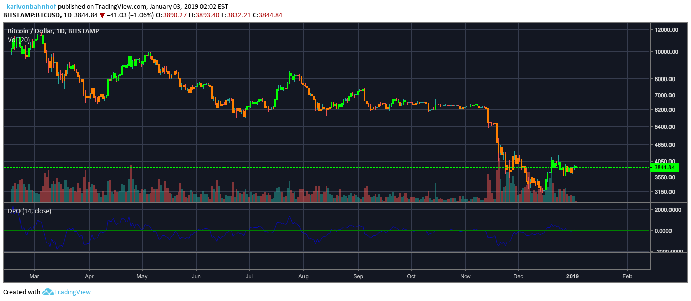
The resulting line gets plotted below the chart and the chart’s candles are colored red or green depending on whether the value of the difference is positive or negative.
This is what the Detrended Price Oscillator, or DPO, looks like on a 1D BTCUSD chart. (I changed the default colors for clarity)
barcolor(pos == -1 ? orange: pos == 1 ? lime : aqua )
Does it work?
Of course it does work, there’s no rocket science in this one. You can use it on any timeframe and play with the length of the span.
On the 1W DPO gives an easy single-glance information about the market:
Even better, it is worth noting that the information you get from the color changes is equivalent to the cross of the Bollinger Band middle line on Bollinger Bands of the same length.
Here on a 1W chart for the lengths of 28:
For very long-term crypto charts this is actually more convenient that the bbands, if you are only looking for the position of the price relative to the mean.
You’ll notice I had to switch off the auto sizing on the chart because due to the periods of cryptocurrency bubbles, the lower and upper Bollinger bands shoot too far.
It won’t be a very difficult job to add candle coloring for the lower and upper Bollinger band crosses either, by the way.
Bottom Line
The Detrended Price Oscillator is indeed similar to SMAs. The information is presented by coloring the chart candles though, which means you don’t have to squint your eyes at the chart when investigating trend cycles.
A marginal advantage but if you have a chart with no candle-coloring script in place, this would be a good choice.


